 雪花测评
雪花测评

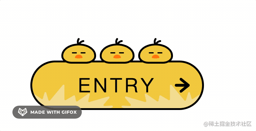
css不仅可以静态地修饰网页,还可以配合各种JavaScript脚本语言动态地对网页各元素进行排版,一名合格的前端工程师是必须精通css的,利用css可以画出各种样式的组件及效果,提升用户的体验。今天雪花博客给大家分享三只小鸟的button按钮样式带:hover鼠标移入的过渡效果,学到就是赚到。
首先需要了解一些前置的基础知识
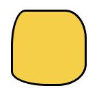
1、border-radius(圆角效果)
#box {
    border-radius: 20px 30px 40px 50px;
}
从效果上也可以看出来分别是左上、右上、左下、右下的圆角。
其实还可以设置椭圆角,椭圆和圆的区别是圆的半径都是一样的,而椭圆则是有长轴和短轴,可以不一样。
可以分别设置长半轴和短半轴的长度,用 / 隔开:
#box {
    border-radius: 20px 30px 40px 50px / 20px 30px 40px 50px;
}
当然,上面这个长短半轴相等了,也就是圆角了。
比如这样设置:
#box {
    border-radius: 20px 30px 40px 50px / 50px 40px 30px 20px;
}
效果则是这样的
通过调整四个角的横竖半轴长度,就可以实现很多形状。
此处省略1000字....直接上整体代码
<!DOCTYPE html>
<html lang="en">
<head>
  <title></title>
</head>
<body>
  <a href="#" class="button button--bird">
    <div class="button__wrapper">
      <span class="button__text">ENTRY</span>
    </div>

    <div class="birdBox">
      <div class="bird wakeup">
        <div class="bird__face"></div>
      </div>
      <div class="bird wakeup">
        <div class="bird__face"></div>
      </div>
      <div class="bird">
        <div class="bird__face"></div>
      </div>
    </div>
  </a>
  <style>
    body {
      padding: 100px;
    }

    .button--bird {
      --main_color: #f4cf47;
      --sub_color1: #f4e19c;
      --sub_color2: #ff8108;
      --base_color: #000;
      --border_radius1: 60px 60px 40px 40px / 48px 48px 30px 30px;
      --border_radius2: 70px 70px 40px 40px / 48px 48px 30px 30px;
      --border_radius3: 40px 40px 40px 40px / 48px 48px 30px 30px;
    }

    .button {
      display: flex;
      justify-content: center;
      align-items: center;

      box-sizing: border-box;
      width: 280px;
      height: 80px;

      text-decoration: none;
      border: solid 3px #000;
      border-radius: 40px;
      background: var(--main_color);
      position: relative;
    }

    .button__wrapper {
      display: flex;
      justify-content: center;
      align-items: center;

      width: 100%;
      height: 100%;

      border-radius: 40px;

      overflow: hidden;
      position: relative;

    }

    .button__text {
      position: relative;
      font-size: 32px;
      letter-spacing: 4px;
      color: var(--base_color);
      transition: all .3s ease;
    }

    .button::before {
      content: '';
      position: absolute;

      right: 20px;
      margin: auto 0;
      width: 24px;
      height: 24px;
      background: var(--base_color);
      clip-path: path('M24,12.02c0-1.09-.75-1.71-.81-1.77L11.17,.45c-.91-.74-2.21-.56-2.91,.42-.69,.97-.52,2.37,.39,3.11l7.12,5.81-13.7-.02h0C.93,9.77,0,10.76,0,11.99c0,1.23,.93,2.22,2.07,2.22l13.7,.02-7.13,5.78c-.91,.74-1.09,2.13-.4,3.11,.41,.58,1.03,.88,1.65,.88,.44,0,.88-.15,1.25-.45l12.04-9.76c.07-.06,.82-.67,.82-1.77Z');
      transition: all ease .2s;
    }

    .button--bird .button__wrapper::before,
    .button--bird .button__wrapper::after {
      content: '';
      position: absolute;
      bottom: 0;
      width: 130px;
      height: 38px;
      background: var(--sub_color1);
      transition: all .5s ease;
      clip-path: path('M13.77,37.35L.25,16.6c-.87-1.33,.69-2.91,2-2.02l12.67,8.59c.81,.55,1.91,.14,2.18-.81l2.62-9.33c.39-1.4,2.34-1.42,2.76-.02l3.6,11.99c.33,1.11,1.74,1.4,2.47,.52L49.38,.52c.87-1.04,2.53-.42,2.53,.95V23.7c0,1.13,1.2,1.83,2.16,1.26l12.75-7.51c.85-.5,1.94,0,2.13,.98l1.5,7.6c.2,1.03,1.37,1.51,2.22,.92l17.74-12.3c1.09-.75,2.52,.25,2.21,1.55l-2.44,10.2c-.26,1.09,.74,2.06,1.8,1.75l30.8-9.04c1.37-.4,2.42,1.26,1.49,2.36l-9.07,10.66c-.83,.98-.1,2.49,1.17,2.42l12.12-.68c1.6-.09,2.12,2.15,.65,2.8l-2.73,1.21c-.18,.08-.38,.12-.58,.12H14.97c-.48,0-.93-.25-1.2-.65Z');
    }

    .button--bird .button__wrapper::before {
      left: 0;
    }

    .button--bird .button__wrapper::after {
      right: 0;
      transform: rotateY(180deg);
    }

    .button:hover .button__wrapper::before {
      transform: translateX(-12px);
    }

    .button:hover .button__wrapper::after {
      transform: rotateY(180deg) translateX(-12px);
    }

    .button:hover .button__text {
      letter-spacing: 6px;
    }

    .button:hover::before {
      right: 14px;
    }

    .birdBox {
      position: absolute;
      top: -54px;
      display: flex;
      justify-content: space-between;
      align-items: flex-end;
      width: 180px;
      height: 56px;
    }

    .bird {
      position: relative;
      width: 56px;
      height: 36px;
      box-sizing: border-box;
      border: solid 3px #000;
      background: var(--main_color);
      border-radius: var(--border_radius1);
      animation: sleep 1s ease infinite alternate;
      display: flex;
      justify-content: center;
    }

    .bird__face {
      position: absolute;
      top: 15px;
      width: 12px;
      height: 6px;
      background: var(--sub_color2);
      border-radius: 50% 50% 50% 50% / 78% 78% 22% 22%;
      transition: .2s;
    }

    .bird__face::before,
    .bird__face::after {
      content: '';
      position: absolute;
      top: -4px;
      width: 8px;
      height: 2px;
      border-radius: 4px;
      background: #000;
    }

    .bird__face::before {
      left: -5px;
    }

    .bird__face::after {
      right: -5px;
    }

    .bird::before {
      content: '';
      position: absolute;
      top: -12px;
      left: 22px;
      width: 12px;
      height: 12px;
      background: #000;
      clip-path: path('M10.23,3.32c-3.54,.63-5.72,2.51-7.02,4.23-.33-1.58-.34-3.54,.93-5.12,.52-.65,.41-1.59-.24-2.11C3.24-.19,2.29-.08,1.77,.57c-3.82,4.77-.31,11.11-.13,11.42,0,0,0,0,0,0,0,0,0,0,0,0,0,0,0,0,0,0-.01-.02,2.49,.04,2.52,0,.1-.14,1.54-4.82,6.59-5.71,.82-.14,1.37-.92,1.22-1.74s-.94-1.36-1.75-1.21Z');
    }

    .button:hover .wakeup {
      animation: wakeup .2s ease;
      animation-fill-mode: forwards;
    }

    .button:hover .wakeup .bird__face {
      top: 20px;
    }

    .button:hover .wakeup .bird__face::before,
    .button:hover .wakeup .bird__face::after {
      animation: eye 5s linear infinite;
    }

    .button:hover .wakeup:nth-child(2) .bird__face::before,
    .button:hover .wakeup:nth-child(2) .bird__face::after {
      animation: eye_2 5s linear infinite;
    }

    @keyframes wakeup {
      0% {
        height: 32px;
        border-radius: var(--border_radius2);
      }

      100% {
        height: 56px;
        border-radius: var(--border_radius3);
      }
    }

    @keyframes eye {
      0% {
        top: -6px;
        width: 6px;
        height: 6px;
      }

      30% {
        top: -6px;
        width: 6px;
        height: 6px;
      }

      32% {
        top: -4px;
        width: 8px;
        height: 2px;
      }

      34% {
        top: -6px;
        width: 6px;
        height: 6px;
      }

      70% {
        top: -6px;
        width: 6px;
        height: 6px;
      }

      72% {
        top: -4px;
        width: 8px;
        height: 2px;
      }

      74% {
        top: -6px;
        width: 6px;
        height: 6px;
      }

      76% {
        top: -4px;
        width: 8px;
        height: 2px;
      }

      78% {
        top: -6px;
        width: 6px;
        height: 6px;
      }

      100% {
        top: -6px;
        width: 6px;
        height: 6px;
      }
    }

    @keyframes eye_2 {
      0% {
        top: -6px;
        width: 6px;
        height: 6px;
      }

      10% {
        transform: translateX(0);
      }

      12% {
        transform: translateX(3px);
      }

      20% {
        top: -6px;
        width: 6px;
        height: 6px;
      }

      22% {
        top: -4px;
        width: 8px;
        height: 2px;
      }

      24% {
        top: -6px;
        width: 6px;
        height: 6px;
      }

      25% {
        transform: translateX(3px);
      }

      27% {
        transform: translateX(0);
      }

      74% {
        top: -6px;
        width: 6px;
        height: 6px;
        transform: translateX(0);
      }

      76% {
        top: -4px;
        width: 8px;
        height: 2px;
        transform: translateX(3px);
      }

      78% {
        top: -6px;
        width: 6px;
        height: 6px;
      }

      80% {
        top: -4px;
        width: 8px;
        height: 2px;
      }

      82% {
        top: -6px;
        width: 6px;
        height: 6px;
      }

      85% {
        transform: translateX(3px);
      }

      87% {
        transform: translateX(0);
      }

      100% {
        top: -6px;
        width: 6px;
        height: 6px;
        transform: translateX(0);
      }

    }

    @keyframes sleep {
      0% {
        height: 36px;
        border-radius: var(--border_radius1);
      }

      100% {
        height: 32px;
        border-radius: var(--border_radius2);
      }
    }
  </style>
</body>
</html>
我们通过纯 CSS 实现了一个可爱的 Button,核心就是用元素 + 伪元素通过 flex + 定位来布局,然后通过 border-radius + clip-path 设置形状,通过 animation + @keyframes 来做复杂的动画,通过 transition 设置过渡效果。
其中要注意的是可以通过设置 animnation-fill-mode: forwards 让动画停在最后一帧,设置 animation-direction: alternate 可以正反交替执行动画。再就是最好通过变量把会变化的样式值提取出来,这样方便配置。
用 CSS 实现一些有趣的效果确实感觉很好,这也是前端工程师专属的快乐。
css想入门满足常用的布局场景以及简单的交互很简单,但是要精通还是需要下一点功夫的,有些效果真的非常烧脑。